Is Suriarco patch really from Swift & Company?
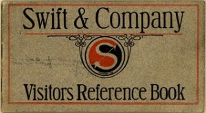
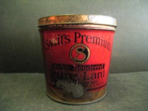
Destry has been trading e-mails with ISCA OA columnist Bruce Shelley regarding something Destry discovered recently while antique hunting. He came across a can of Swift Premium lard, fortunately empty. What jumped out at him was the logo for the company is exactly that of a patch that surface a few years back and was attributed to Suriarco Lodge 239.
Some background. Suriarco is derived from the home council “Suwanee River Area Council” out of Florida. Records indicate that the first OA lodge there was named Suriarco. Up until about ten years ago, this lodge was not known to have any patches or issues such as neckerchiefs.
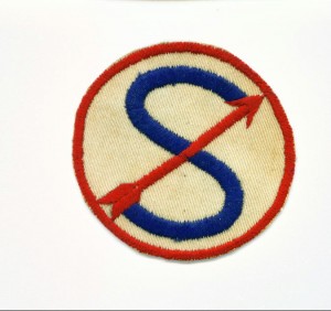
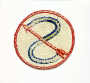
Then the following patch surfaced (see front and back below):
The possibility of this being a Boy Scout Order of the Arrow patch from a lodge with no known issues could turn a piece of cloth from being a curiosity into something worth thousands of dollars.
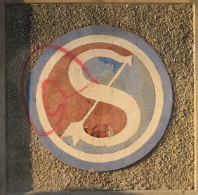
Here are examples of the Swift Premium Company’s logo at the time. The exact same “S”, arrow, and red-white-blue colors although laid out differently.
As Bruce noted:
Interesting, but not conclusive. I wonder if the badges had been worn on
uniforms of delivery people or something?
And a tub of lard, which the patch might turn out to be as well:

on May 12th, 2011 at 3:43 pm
I’ve kinda always thought it was pure lard but nobody seemed to want to listen…..
Destry
on May 24th, 2011 at 3:05 pm
I don’t know…
(a) I wouldn’t say the “exact” same S and arrow. The Swift S, in all three versions shown, varies in thickness–thin in the top and bottom loops, thick across the middle–with serifs likely being intended as part of the the head and fletching of the arrow. The patch S is of uniform thickness and the color contrast with the arrow means the S is probably sans serif as well.
(b) As written this minimizes the way the colors are “laid out differently”–I think the arrangement of red and blue is more than casual on the Swift logo and this is a significant difference. In effect, the Swift design contains three elements: an S, an arrow, and a yin-yang type symbol rendered in blue and red. The patch has the same colors, but only really has two of the three elements, the S and the arrow.
I have no idea whether this is a Scout or an OA patch, but I really would doubt any connection to Swift Co. unless they had other versions of the logo which were a lot more like the patch than like the ones pictured here.
on August 9th, 2011 at 11:07 am
Come on Dave, it’s just too close to even say it’s not a possibility. You’re talking about going from logo to embroidery here so there’s going to be some minor differences but the logo is the same none the less. Research on this will continue on a limited basis, this has really got me interested in figuring out if we’re right.
on June 14th, 2022 at 4:52 pm
Was anything concluded about this question from 2011? I have one of these patches I found in 1991 in a tin of WW2 patches and I would love to know what it is. I always thought it was some kind of squadron insignia.